Resting state FSLnets practical
FSLNets is a toolbox for carrying out basic network modelling from FMRI timeseries data. It is a collection of Python functions that run a connectivity analysis between sets of timeseries.
Estimating network matrices and performing statistical analyses on these timeseries involves the following steps:
- Extracting subject-specific timeseries relating to a given set of spatial maps of nodes. For example, using dual regression stage 1 outputs
- Looking for group-level noise components that you want to remove
- Calculating correlations (full or partial) between all pairs of timeseries to build the network matrix (netmat) for each subject
- Looking at the group-average network matrix and how nodes cluster together into a hierarchy
- Performing group-level statistical analysis
Contents:
- Before running FSLnets
- Defining nodes and edges to run network modelling analysis
- Networks estimation
- Estimating network matrices from dual regression outputs
- Group-average netmat summaries
- Calculating group-average netmats
- Cross-subject comparison with netmats
- Comparing individual edge strengths between subject groups
- (Optional) Multivariate cross-subject analysis
- Multivariate comparison of whole netmats across subject groups
In the next sections we will go through an example of how to perform network modelling using resting-state data (i.e. the output from melodic followed by stage 1 of dual regression). However, note that you can analyse any set of timeseries with FSLNets.
Before running FSLnets
Before you run FSLnets, you need to prepare several things:
- Define 'nodes'
The nodes are the spatial maps that define the regions included in our network modelling. Nodes can be defined in a number of ways, but for this practical we have already generated the nodes for you using the following group ICA command to extract 100 components (please do not run this again):
melodic -i input_files.txt -o groupICA100 \
  --tr=0.72 --nobet -a concat \
  --bgimage=$FSLDIR/data/standard/MNI152_T1_2mm_brain.nii.gz \
  -m $FSLDIR/data/standard/MNI152_T1_2mm_brain_mask.nii.gz \
  --report --Oall -d 100
To look at the temporal relationship between our nodes, we must first extract the timeseries from each node. Again, the timeseries extraction can be done in a number of ways. For this practical, we have already extracted the timeseries from the 100 nodes by running dual regression with the command below, and using the stage 1 output.
dual_regression groupICA100/melodic_IC 1 -1 0 groupICA100.dr $(cat input_files.txt)
For visualisation purposes, FSLnets requires a PNG image of each node. We
have created these for you (located
in ~/fsl_course_data/rest/Nets/group100.sum) using the following
command:
If you are using Group ICA to define your nodes, FSLNets can generate the node
thumbnails for you - have a look at the nets.load help documentation
for more details.
In fact, if you are planning to use dual regression to extract the per-subject
node time series, you can use the nets.load_from_images function to
perform the first stage of dual regression for you.
slices_summary groupICA100/melodic_IC 4 \
  $FSLDIR/data/standard/MNI152_T1_2mm   \
  groupICA100.sum -1
This command takes the 4D image containing the group ICA components
(groupICA100/melodic_IC), sets a minimum threshold of 4, specifies
the MNI152_T1_2mm as the background image, and creates the output
directory groupICA100.sum, which contains the png images of each
node. The -1 flag specifies that single-slice summaries should be generated
instead of 3-slice summaries.
Getting started
To start this FSLNets network modelling practical, open a terminal
and cd to the working directory of this practical, then start a
Python session by running fslipython:
cd ~/fsl_course_data/rest/Nets
fslipython
The remainder of this practical will take place within this Python
session. Let's start by importing the fsl.nets package,
and configuring matplotlib for plotting:
%matplotlib
from fsl import nets
Networks estimation
Now we are ready to start setting up some important parts for our network modelling analysis. To load in all subjects' timeseries data files from the dual-regression output directory, run:
ts = nets.load('groupICA100.dr',
               0.72,
               varnorm=0,
               thumbnaildir='groupICA100.sum')
Explore the ts object - type
in ts., and then press the TAB key to
bring up a list of the fields contained in the ts object. You can
bring up the help documentation for any fields by
typing ts.‹fieldname›? and pushing
enter. For example, type ts.ts? and push enter -
this field contains the stage 1 dual regression timeseries from all subjects.
Try to figure out what information the other fields in the ts
object contain.
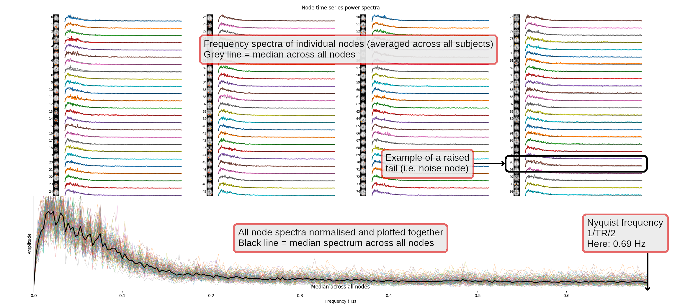
We will now have a quick look at the temporal spectra of the resting state networks (RSNs), as a quick check that these look reasonable. Running the following command will open a figure in which the top part of the plot shows one spectrum per group-ICA component, each averaged across all subjects. The bottom part shows the same thing, but with all spectra overlapping, and the median power spectra across all runs as a thick black line.
nets.plot_spectra(ts)Click here for more information on how to read the figure
plot_spectra or plot_timeseries plots are too
big to fit on your display, experiment with the ncols,
subjects, and nodes arguments - you may wish to
generate several figures, each containing a sub-set of subjects and nodes. Type nets.plot_spectra? and nets.plot_timeseries? to bring
up the documentation for the two functions.
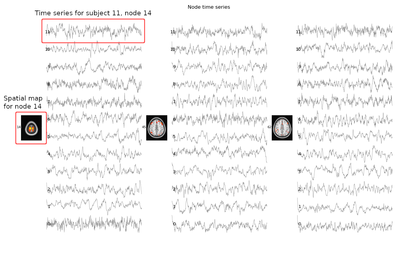
We can also inspect the time series using
the nets.plot_timeseries function. This command will open a
figure which displays the time series for all of our subjects, for a few nodes
which have been determined to be noise:
nets.plot_timeseries(ts, ncols=3, subjects=range(12), nodes=[14, 45, 62])Click here for more information on how to read the figure
Cleaning components
There is the option to remove components' (nodes') timeseries that
correspond to artefacts rather than plausible nodes. Similarly to the last
practical, you need to decide this by looking at the spatial maps, timeseries,
and frequency spectra. To save time, we have listed the good components for
you. Run the following commands to list the good components and apply the
cleanup (remember, you can type nets.clean? to
bring up the documentation for the nets.clean function, or any
other FSLNets function):
goodnodes = [0,  1,  2,  4,  5,  6,  7,  8,  10, 11,
             12, 16, 17, 18, 19, 20, 21, 22, 24, 25,
             26, 27, 28, 29, 30, 31, 32, 33, 34, 35,
             36, 37, 39, 41, 42, 46, 47, 48, 49, 51,
             52, 54, 55, 56, 57, 58, 60, 61, 63, 64,
             65, 69, 70, 71, 72, 73, 76, 79, 80, 85,
             86, 92, 96]

nets.clean(ts, goodnodes, True)
Calculating netmats for each subject
Now you are ready to compute a network matrix for each subject, which is in
general a matrix of correlation strengths (correlation coefficients). We will
compute two different versions of these netmats for each subject: a
simple full correlation ('corr'), and a partial correlation that has
been regularised in order to potentially improve the mathematical
robustness of the estimation ('ridgep'). The partial correlation
matrix should do a better job of only estimating the direct network connections
than the full correlation does.
Note:
Fin the following variable names refers to Full, and
Prefers to Partial described above.
Fnetmats = nets.netmats(ts, 'corr',   True)
Pnetmats = nets.netmats(ts, 'ridgep', True, 0.1)
The full and partial netmats are now calculated for all subjects. Now run
this command to look at the size of the Fnetmats variable:
Fnetmats.shape
Can you figure out how the netmats of all subjects are saved in this? Answer.
In the next section, you are going to compute the group average and take a look at the average network matrix.
Group-average netmat summaries
We have computed the full and partial network matrices for each individual
subject. The next step is to perform a simple group-level analysis to look at
the mean network matrix across all subjects. This can be done using the
command below, which saves out both the simple average of netmats across all
subjects (Mnet) and the results of a simple one-group t-test
(against zero) across subjects as Z values (Znet).
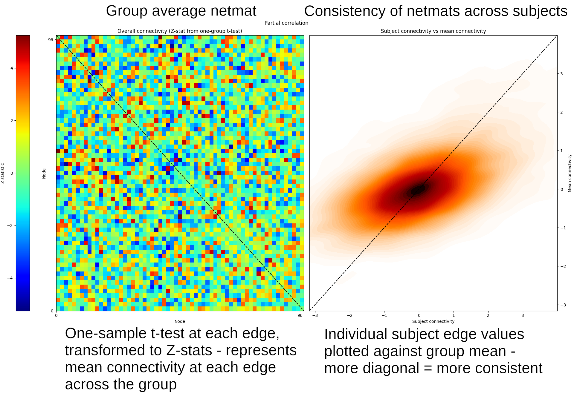
Znet_F, Mnet_F = nets.groupmean(ts, Fnetmats, False)
Znet_P, Mnet_P = nets.groupmean(ts, Pnetmats, True, 'Partial correlation')
If you see the message "invalid value encountered in divide", don't be alarmed. This is ok for this example. The plots that we create with the above commands may also take some time to generate, so please be patient.
The third input to this command indicates whether or not to display a
summary figure. This is set to True for the second command run
on the partial netmats, so the summary figure for this will show up (the
fourth argument, "Partial correlation" allows you to
set the plot title). On the left, this figure shows the results from the
group t-test, and on the right is a consistency scatter plot showing how
similar the results from each subject are to the group (i.e. the more this
looks like a diagonal line, the more consistent the relevant netmat is
across subjects).
The value of Mnet_P in row 3, column 27 is ~6.6 (you can check
this by typing Mnet_P[2, 26] into Python and
hitting enter - Python starts counting from 0, so row 3 is referenced using
the index 2, and column 27 referenced using index 26).
Note that the node numbers used above (2 and 26) are referring to the
locations, (a.k.a. indexes) of nodes in the
netmats after removal of noise nodes via nets.clean. This
may not be the same as the original node indexes
before nets.clean. You can find out the original node index
via ts.nodes - for example, try
running ts.nodes[2]
and ts.nodes[26] - do you understand the meaning of
the results? Click here for the answer.
Group average network hierarchy
The next thing we can look at is how nodes cluster together to form larger resting state networks. For this we run a clustering method that groups nodes together based on their covariance structure. To view this network hierarchy, run:
nets.plot_hierarchy(ts, Znet_F, Znet_P, 'Full correlations', 'Partial correlations')Click here for more information on how to read the figure
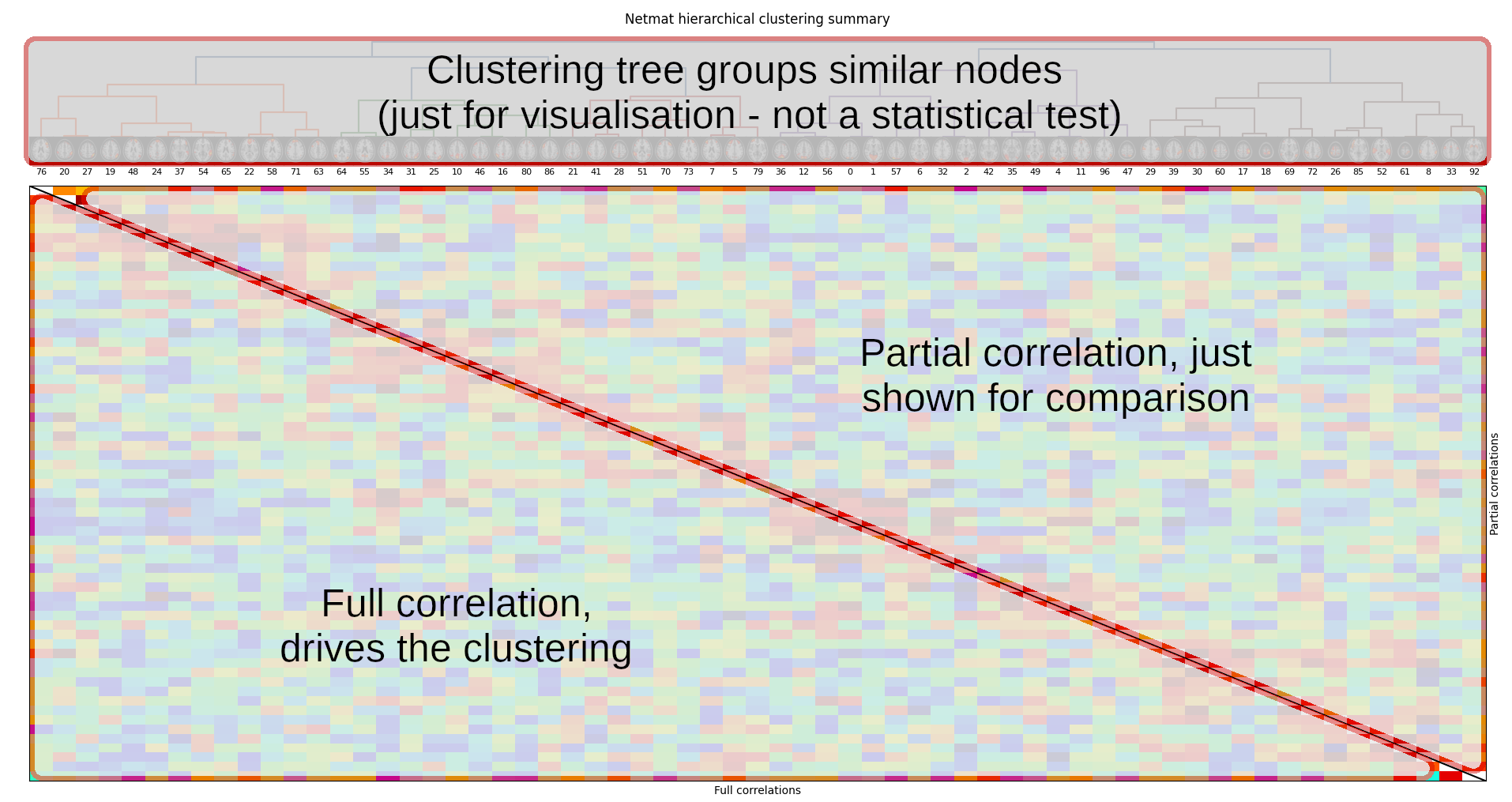
If you look closely, you might be able to see a set of nodes which have been grouped together, and which resemble a large-scale resting state network called the default mode network (that you may have heard about).
It is possible to visualise this hierarchical arrangement in a different way,
using the nets.netweb function. Run the following code - it will
open a new tab in your web browser:
nets.web(ts, (Znet_F, Znet_P), ('Full correlation', 'Partial correlation'))
This page displays the same clustered node hierarchy (known as a dendrogram) arranged in a circle, with the top of the hierarchy (the root) in the centre, and the nodes (the leaves) around the perimeter. You can click on a node to highlight the connectivity from that node to its most strongly connected neighbours.
Cross-subject comparison with netmats
We are now able to test whether the netmats differ significantly between healthy controls and patients with a tumour using a two-sample t-test. This is a 'univariate' test, as we will test each network matrix edge separately for a group-difference, and then we will estimate p-values for these tests, correcting for multiple comparisons across all tests. By analogy to high-level task-fMRI analyses: you can think of each subject's netmat as being an NxN image of voxels, and the univariate testing as modelling each voxel (in isolation from each other) across subjects.
We have already created the design files for you to run the two-sample
t-test. If you want to look at the design, open the GLM GUI (in a new terminal
window), click the Load button, select the ~/fsl_course_data/rest/Nets/design/unpaired_ttest_1con.fsf
file, then click the View design button to see the design.
randomise from within Python, with 5000 permutations for
each contrast):
p_corr,p_uncorr = nets.glm(ts, Pnetmats, 'design/unpaired_ttest_1con.mat', 'design/unpaired_ttest_1con.con')
Once randomise has finished, you will see a figure showing "netmats" containing corrected p-values. The results above the diagonal show edges where the two-group t-test is significant, at corrected-p<0.05.
Click here for more information on how to read the figure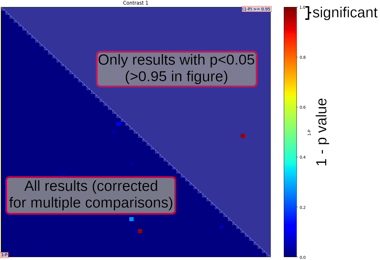
Displaying significant group differences
We will now run a command that shows which nodes and edges were linked to the strongest differences between the groups:
nets.boxplots(ts, Pnetmats, Znet_P, p_corr[0], groups=(6, 6))
Each pair of thumbnails corresponds to one position in the NxN network matrix and the node numbers are listed in the text captions. The coloured bar joining each pair of nodes tells you what the overall group-average connection strength is: thicker means a stronger connection; red means it's positive, and blue means that the connection is "negative" (meaning that the two nodes tend to anti-correlate on average). The "P value" numbers tell you the 1-p-values - so the higher these are, the more significantly different this edge strength is between the two groups. Anything less than 0.95 is not significant, after correcting for multiple comparisons.
The plots on the right show how the partial correlation differs between the patients and the controls for each of the edges with the strongest group difference. The plots summarise the distributions of the correlation values (connection strengths) in the two groups - Group 1 being healthy controls in this data, and Group 2 being tumour patients - for each node-pair.
Click here for more information on how to read the figure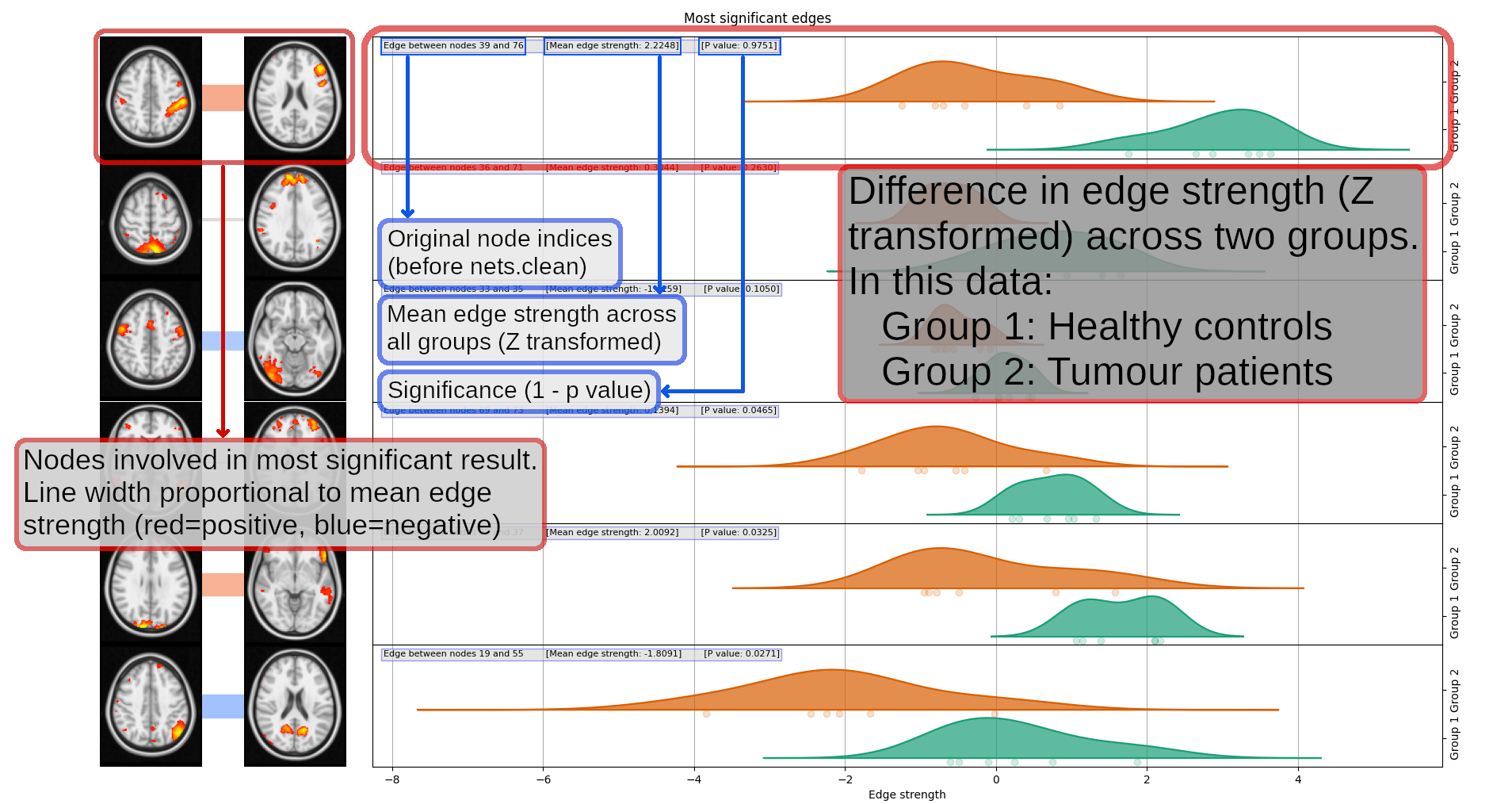
If you are finishing the practical here and not doing the optional section below, type exit in the terminal to exit Python.
(Optional) Multivariate cross-subject analysis
Finally, we will now carry out multivariate cross-subject analysis - meaning that, instead of considering each netmat edge in isolation (like we did above) we will consider the whole netmat in one analysis.
For example, we can attempt to classify subjects into patients or controls using machine learning methods, such as support vector machines (SVM) or linear discriminant analysis (LDA). Such methods look at the overall pattern of values in the netmat, and try to learn how the overall pattern changes between the two groups.
The following command feeds the regularised partial correlation netmats from both groups into LDA. It uses a method known as leave-one-out cross-validation to train and test a classifier, and reports in what percentage of tests it was successful at discriminating between patients and controls:
nets.classify(Pnetmats, (6, 6))
This function uses the scikit-learn
library to perform classification. You can use any other classifier
available in scikit-learn by passing a third argument
to nets.classify. For example, to use
a random
forest classifier:
from sklearn.ensemble import RandomForestClassifier
nets.classify(Pnetmats, (6, 6), RandomForestClassifier())
One "downside" of such multivariate testing is that you can no longer make strong statistical claims about individual edges in the network - the whole pattern of edges has been used, so we don't know which individual edges are significantly different in the two groups.
Type exit in the terminal to exit Python.
The End.